Sunday 17 March 2013

New York Photo Competition

After November's New York trip, a photography competition was announced, 'Scenes from New York City', which I entered. The rules asked for a maximum of four entries, and so I entered the following:


Two of my entries were selected to be printed large-scale and featured in the 'Scenes from New York City' exhibition, in the college reception. As one of two illustrators with selected work amongst photography students, I was quite proud. Here they are, among some great entries:


...

And here are some of my other photos from New York:


...

Another recent success in photography: 


A large print of this photo sold for $30 on Society6- the profit I earn from this is only a small fraction, but as my first sale to a total stranger, I consider it a success! 

http://society6.com/MatCoffey/Red-Mini_Print


Friday 15 March 2013

Historic Wartime Animation

For the latest project, I chose to accept the option to continue further work with Age UK on the Historic Wartime brief. One aspect of the project required us to take our final image and animate it in some way; I took this:


...and created this...

"I always carried my gas mask"


Initially, the idea of creating an animation from my image seemed potentially problematic, due to the clash of the portrait format of the picture, and that required for a video to be played on a TV. At first I intended on re-assembling and colouring the image from scratch in landscape format, but decided this wasn't necessary to produce the basic animation I had in mind. The piece came together well, with the multiple separate elements lending themselves well to the animation. I believe the motion enhances the ghostly feel, and I felt Glenn Miller's 'Moonlight Serenade' encapsulated the era portrayed well, with an inherently nostalgic quality to it. The pace complimented the animation's, and I'm satisfied with the outcome.

Monday 11 March 2013

Photograms

During my work on the Holocaust Awareness project, I followed a suggestion of working with photograms to potentially generate some ideas or material to work with. The following is Wikipedia's summary of the process:

"A photogram is a photographic image made without a camera by placing objects onto the surface of a light-sensitive material such as photographic paper and then exposing it to light. The usual result is a negative shadow image that shows variations in tone that depends upon the transparency of the objects used. Areas of the paper that have received no light appear white; those exposed through transparent or semi-transparent objects appear grey."

After observing the process, I gathered a few things that could yield imagery to work with the project, as well as a selection of personal objects I just felt would be interesting to photogram. The following are some of the results:  (Excuse the grainy scans)


And finally, the image I produced for the project (As shown in the previous post):


I found the technique to be really interesting, with the surreal X-ray-like effect of the results, and the surprising potential for further exploration; changing variables such as light exposure time, light source and placement can create an array of effects with just one object.

Also, I only walked into doors and walls two or three times while in the darkroom...


Sunday 10 March 2013

Holocaust Awareness Project

The Holocaust Awareness Project was one I selected from a choice of three, for the same reasons I chose the Historic Wartime brief: an interest in history (particularly WW2), and the idea of preserving memories. The brief asked for a poster to be created for the purpose of Holocaust Awareness, specifying only that the phrase "Keeping the memory alive- Journey through the Holocaust" be included.

After collecting appropriate imagery from which to draw inspiration, I started producing rough water-coloured sketches of different approaches and ideas, initially looking at conceptual scenes; I decided to use nature as a theme, for it's versatility in visual analogies, and ability to reflect different moods/qualities. I wanted the images to reflect loss and hope in differing degrees, the following are some examples:


This piece reflects the origin of the name of Auschwitz's extermination camp, Birkenau- the German translation of the Polish word for Birch forest (named for their local abundance).


With the above piece, I decided to create a visual antithesis to the last piece, using a similar concept.


The idea of deforestation as a euphemism for genocide.

After experimenting with such concepts, I began to branch away from depicted scenes such as the above in response to advise and feedback, in order to gear my results towards a more poster-like appearance.


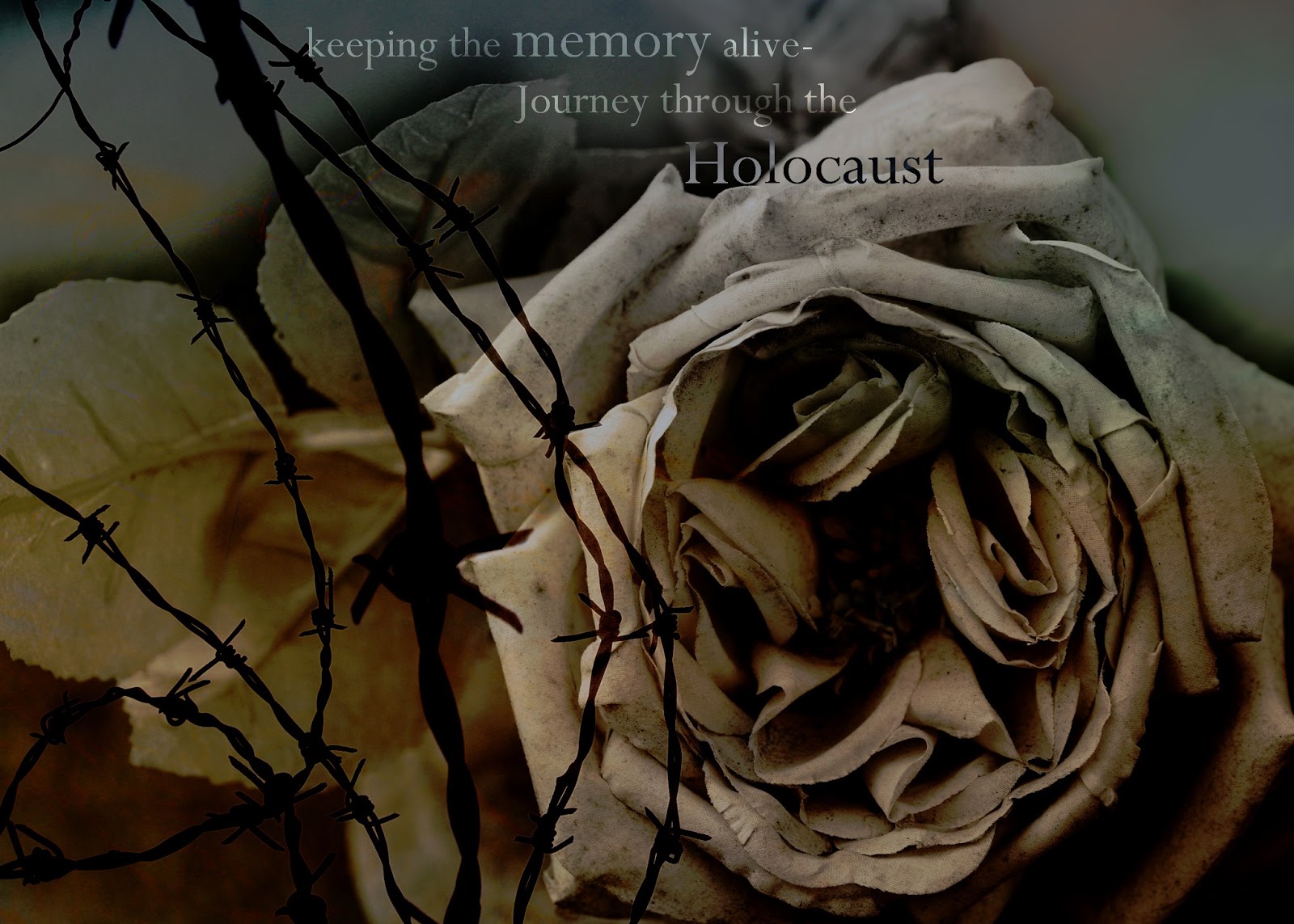
I produced this piece using photos of mine, introducing type. After review and feedback, it was agreed that it looked too obvious and aesthetically 'off' for a poster. Following on from this, I started abstracting elements from this piece both manually and digitally in order to generate some compositions to potentially work with. This method produced some interestingly bold and graphic results, in-line with  my aim. One of my more successful examples: 


The dotted quality to the ink on an enlarged photocopy provided a look very similar to that of some old posters, which worked nicely. The less distinguishable form of the rose adds an interesting dynamic.

Another technique I tried was the use of photograms. After some experimentation (the technique was totally new to me), I finally arrived at this:


I felt the ghostly-quality of the photos produced via this method fit well with the idea of memory, tying  into the work of my last project. I hope to make further changes to the later poster designs, and possibly explore more ideas before the project deadline, most likely with more interesting use of typography.