After collecting appropriate imagery from which to draw inspiration, I started producing rough water-coloured sketches of different approaches and ideas, initially looking at conceptual scenes; I decided to use nature as a theme, for it's versatility in visual analogies, and ability to reflect different moods/qualities. I wanted the images to reflect loss and hope in differing degrees, the following are some examples:
This piece reflects the origin of the name of Auschwitz's extermination camp, Birkenau- the German translation of the Polish word for Birch forest (named for their local abundance).
With the above piece, I decided to create a visual antithesis to the last piece, using a similar concept.
The idea of deforestation as a euphemism for genocide.
After experimenting with such concepts, I began to branch away from depicted scenes such as the above in response to advise and feedback, in order to gear my results towards a more poster-like appearance.
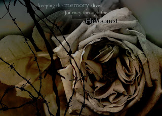
I produced this piece using photos of mine, introducing type. After review and feedback, it was agreed that it looked too obvious and aesthetically 'off' for a poster. Following on from this, I started abstracting elements from this piece both manually and digitally in order to generate some compositions to potentially work with. This method produced some interestingly bold and graphic results, in-line with my aim. One of my more successful examples:
The dotted quality to the ink on an enlarged photocopy provided a look very similar to that of some old posters, which worked nicely. The less distinguishable form of the rose adds an interesting dynamic.
Another technique I tried was the use of photograms. After some experimentation (the technique was totally new to me), I finally arrived at this:
I felt the ghostly-quality of the photos produced via this method fit well with the idea of memory, tying into the work of my last project. I hope to make further changes to the later poster designs, and possibly explore more ideas before the project deadline, most likely with more interesting use of typography.


preview.jpg)
No comments:
Post a Comment