Friday, 3 May 2013
Creative Review- 'Vinyl frontier'
An article I read recently that I thought to be interesting was one on BBC News, linked from another page, under the tagline 'Vinyl Frontier'. The article was written in correlation with the recent event "Record Store day"- 'a celebration of popular music culture with particular appeal for those who collect rare vinyl releases'. The event is international, and sees a vast array of limited edition vinyl records by a plethora of artists released all on one day, at independant record stores. I attended a participating store in Manchester on the day to pick up a record; my four-hour wait in a line, wrapping around the block attests to the event's massive popularity, which is the topic the article addresses. Vinyl has been seen to be an archaic format in decline, 'doomed to extinction' along with even CDs and all physical formats- as indicated by the collapse of HMV... however, things appear to have been changing recently. The story reports a large increase in vinyl album sales since 2008, and the massive popularity of Record Store Day served to kill any doubt of this. I find this trend to be interesting, because it seems to defy the widespread fears of a kind of 'digital revolution'... the death of the physical, and rise of the digital- with both music and art. As a collector in general, I love to own physical copies of the music I like, and I feel the vinyl record is the greatest format- the album artwork on a satisfying 12"x12" scale, and the record itself as an object of interest and ceremony, as opposed to a disposable digital file. Perhaps this rise in popularity is a reflection of a general resurgance in the value placed on physically owning art, which is surely great news for most.

Memory
For the latest project. the title given was 'Mood and Memory'- A competition brief. After some consideration, I decided to depart from the original brief in order produce something I felt worked, rather than attempt to enter the competition with some kind of compromise. It asked us to produce work reflecting the music of Gustav Holst's 'The Planets', while relating to memory- which I found to be seperately viable concepts, but too disparate to combine in a way that worked. I decided instead to simply focus on the memory aspect, a theme I have worked with for the previous two briefs and have found to be interesting
My first idea was to work with the concept of 'Biological Memory', how the Earth 'remembers' its past through such means as fossils, or how a creature's anatomy retains similarities to long-gone ancestors. To start with, I created this piece:

This piece of course reflects the evolutionary origins of modern birds. The dinosaur was painted in ink, and applied to a photo of mine. I had hoped to continue this theme with further photogrphy-illustration hybrids, but I realised this route became very limited due to my lack of relevant photo resources.
After reaching a logistical dead-end, it become obvious I had to once again alter plans. Instead of this idea, I thought about reflecting the memory of people, and how it may live on through creative legacies; art, music and literature. Each time a book is read for example, the memories, thoughts and feelings of an individual are relived by another. In this sense, a mortal may become eternal. As a subject, I chose to depict American poet and author Edgar Allan Poe. I felt he was a good choice for the emotive potency of many of his works, with their dark themes appealing personally- Additionally, I feel his portraits reflect a melancholic and tortured man, almost as if he was a character invented around his works. The portrait-photo is dated from 1848-

http://literature.wikia.com/wiki/Edgar_Allan_Poe
The following are the pieces i created-
I decided to paint with ink again, rather than draw with pen or pencil, as I felt this would yield the most appropriate, dark and grungey aesthetic- and of course, the connotations of flowing, Raven-black ink. I started with his portrait, attempting an expressive and free style, painting water over the ink while wet to allow bleed.

From this I deccided i could create individual elements that could be combined, in the style of my Age UK work. The next pieces reflect this-


And then Poe once more:

I then proceeded to combine and arrange the paintings digitally. Here are the results:


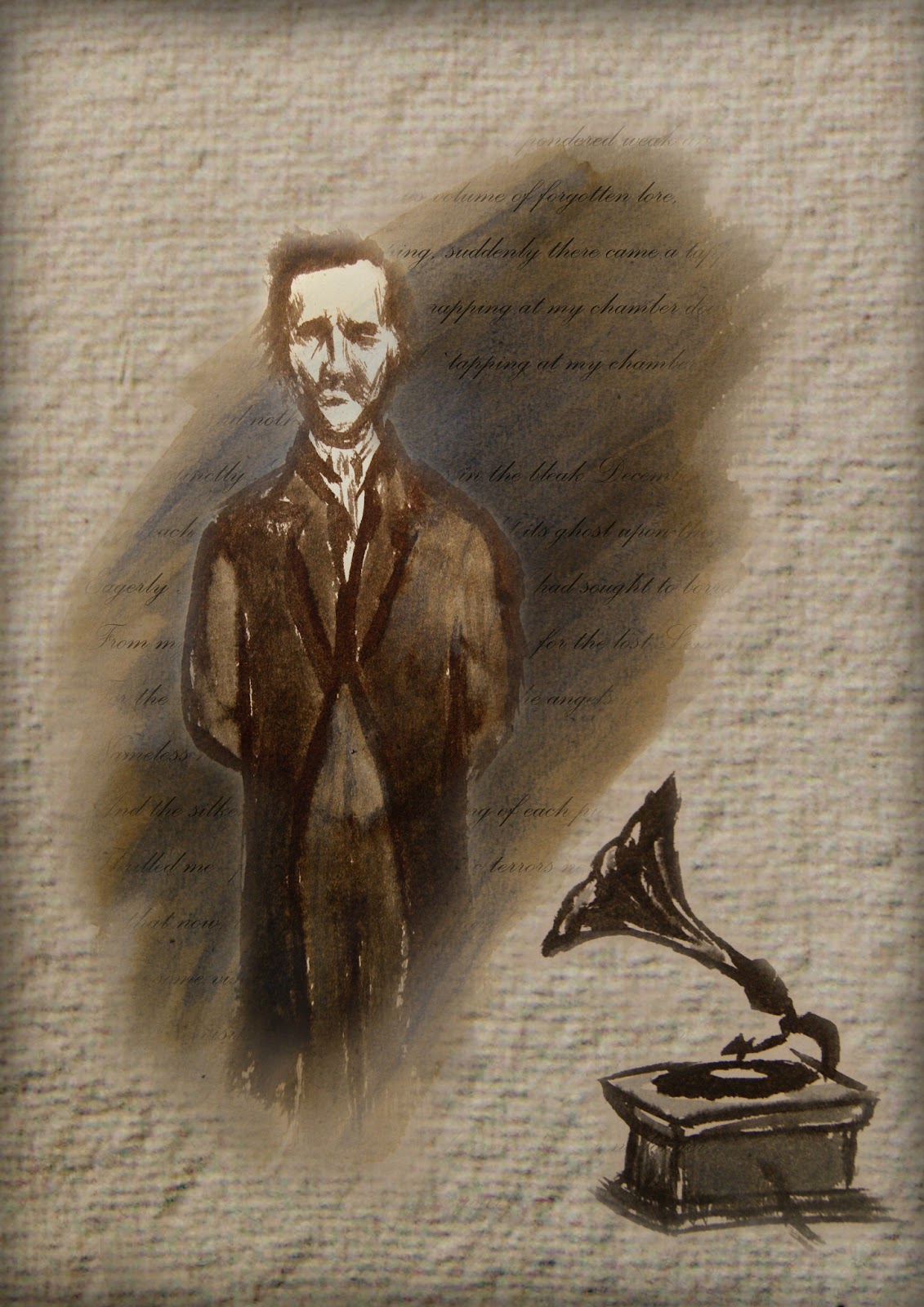
With each piece, I wanted to portray the idea of the man behind the words manifesting- a living memory, each time they are heard and read. The textured paper and sepia tones helped to give the appropriate aged feel, while the ink marks contributed a sense of darkness and mood. I was pleased with the resulting images, particularly the last. Given more time, i feel the project could be greatly explored using this format, with a range of authors, musicians, artists...etc.
Thursday, 25 April 2013
Creative Review- "Cracked Actor"
I recently discovered the 1975 documentary "Cracked Actor", that followed a young, rising star David Bowie whilst on tour in LA. The film was re-released on TV with an added reflective summary and introduction by it's director Alan Yentob, to coincide with the London V&A Museum's current retrospective 'David Bowie Is' exhibition (which I shall be attending in June). The program comprises of interviews with Bowie and his fans, mixed in with alluringly-atmospheric montages of concert footage, songs and filming on the road.
One of the opening scenes of the documentary, is a blurred shot that focuses to reveal an eerie white face, as thick paste is increasingly applied- unsettlingly reminiscent of some kind of cadaver embalming. The scene shows the process of a facial cast being taken, the defined and gaunt features leaving no doubt as to who's beneath it all- A shot of the empty cast yields to the title screen, followed by the scene of Bowie wearing and removing a mask of his own face. This sequence serves as a clever visual metaphor, reflecting the nature of the themes explored in the documentary, and it is these that I find fascinating- not just a talented singer-songwriter, but a performing artist.

www.freewebs.com/theyearofthediamonddog
The director sets the scene and describes Bowie's use of personas over his career- constructed characters in which he fully immersed himself, on-stage and off. 'I couldn't decide whether I was writing characters, or whether the characters were writing me'- Bowie remarked, introspectively discussing his reasons for performing shows as anyone other than David Bowie. He described getting 'lost' in his creations, to the point of mental instability, a reflection of his absolute commitment- here, he is shown 'between roles', yet still very evidently in a fragile state of mind, and heavily addicted to cocaine. He went on to say 'that's something I feel very strongly about, that one isn't totally what one has been conditioned to think one is- there are many facets to the personality which a lot of us have trouble finding'- an interesting idea that I definitely see truth in. These personified 'facets' of himself are something I experienced personally during the 'Invented Personas' project; my character became an extension of certain personal interests and traits.

www.vam.ac.uk
The interviews conducted mostly in hotel rooms and limousines also probed as to how and why his unique array of characters, and the resulting theatrical stage shows came to be; 'I could always write better stories than everybody else' , he said- 'more than anything else, I saw that a lot of my songs were very illustrative and picturesque'. This sense of vision and innovative crossing of creative outlets is something I find inspiring. Similarly, I hope to explore creative hybridity through photography, illustration and narrative skills.
'Cracked Actor' is a valuable insight into the creative (yet fragile) mind of David Bowie during his rise through fame, already with formidable success- yet fated to subsequently produce amongst some of his most iconic works. A man of masks.

www.tumblr.com/tagged/bowie
Tuesday, 23 April 2013
"I wish I'd done this"
A creative genius whose work consistently inspires and impresses me is Diego Fernandez, a digital artist from Argentina. His work almost exclusively consists of portraits of women; beautiful imagined characters ethereally rendered and often materialising from negative space, as if dream-like apparitions. Each piece is sophisticated in it's detail and arrangement, despite the elegant minimalism that forms the foundations of his work. I could have essentially chosen any of his drawings or paintings to write about, and much of what I will say about this piece could apply to all of it, but here is one that serves to represent everything of his that make me think "I wish I'd done this"...

As with this piece, many of Diego's works are either monochromatic or of a limited colour palette, an aesthetic I personally prefer as evidenced across my blog- even in my photography, in many instances. The blue tinge combined with the look of the woman creates a slightly melancholic feel, that may inspire contemplation within the viewer, a quality I admire. The piece doesn't even have to contain any provocative imagery to elicit an emotional response, it does so without being obvious.
Another reason this portrait impresses me is that it showcases the height of traditional media in my eyes, and it was with pen and pencil drawings and concept sketches that I found my obsession with art. However, the look of this piece is deceiving; it is in fact digitally drawn. This is a skill I currently lack, but I would like to learn it, and greatly respect it- especially to replicate pen and pencil as subtly and successfully as it does, certainly a formidable achievement. The style of traditional art with the versatility of digital is in my opinion 'the best of both worlds', giving a classic look to a very modern process- and it certainly caught me out upon first finding these works.
A feature I like in Diego's work is the varying degrees of complex arrangement and interaction of elements, looking natural, like in the instance of the hair in this piece and how it appears as if it could be conceivably arranged in real life. Complexity and simplicity are paradoxically both very applicable, which in itself is enviable- this, combined with perfectly-drawn imagery, is why "I wish I'd done this".
'In Fashion'

One of the subjects I enjoy attempting in illustration is portraits- this stems from both the sense of achievement that comes from successfully depicting a recognisable and/or realistic image, and also my interest in faces / masks and the related themes of persona and identity. The face depicted by Diego here is an idealised take on realism, despite the surreal elements of subject matter frequently featured. I believe that another gauge of quality in portraiture is the ability to depict and evoke emotions, which this woman's face certainly does, with captivating subtlety.
The inclusion of the bird is something that makes what would still be an otherwise creative portrait into something a little different, and this is a trademark theme running through various works of his; reality-defying flora and fauna decorating and accentuating the characters. Nature has always been a huge fascination of mine, and a constant personal influence.
The inclusion of the bird is something that makes what would still be an otherwise creative portrait into something a little different, and this is a trademark theme running through various works of his; reality-defying flora and fauna decorating and accentuating the characters. Nature has always been a huge fascination of mine, and a constant personal influence.
The detailing of the drawing is very fine and intricate, from the soft shading and gentle highlights of her face, to the rich tones of the painstakingly-rendered hair that gives the illusion of shine. Diego often uses the hair of the subjects to transform natural into the surreal and give interesting dynamics to the pictures, like the flow and motion that is lent to the composition here.
As with this piece, many of Diego's works are either monochromatic or of a limited colour palette, an aesthetic I personally prefer as evidenced across my blog- even in my photography, in many instances. The blue tinge combined with the look of the woman creates a slightly melancholic feel, that may inspire contemplation within the viewer, a quality I admire. The piece doesn't even have to contain any provocative imagery to elicit an emotional response, it does so without being obvious.
Another reason this portrait impresses me is that it showcases the height of traditional media in my eyes, and it was with pen and pencil drawings and concept sketches that I found my obsession with art. However, the look of this piece is deceiving; it is in fact digitally drawn. This is a skill I currently lack, but I would like to learn it, and greatly respect it- especially to replicate pen and pencil as subtly and successfully as it does, certainly a formidable achievement. The style of traditional art with the versatility of digital is in my opinion 'the best of both worlds', giving a classic look to a very modern process- and it certainly caught me out upon first finding these works.
A feature I like in Diego's work is the varying degrees of complex arrangement and interaction of elements, looking natural, like in the instance of the hair in this piece and how it appears as if it could be conceivably arranged in real life. Complexity and simplicity are paradoxically both very applicable, which in itself is enviable- this, combined with perfectly-drawn imagery, is why "I wish I'd done this".
Sunday, 21 April 2013
1, 2, 3
One
One of the most significant pieces of advice I have been given this year, is to look into incorporating photography into my illustration. My interest in photography is evident in the ratio of photos to drawings featured on my blog, an observation which led a friend to jokingly remark earlier in the year that I had "chosen the wrong course". More than one person have commented on the compositional strength of certain works of mine, and their alikeness to something you might see in a photo. After having a couple of my photos featured in a college display, It was suggested by Gary that I look to introduce this interest to my illustration work in some way, a new direction I must experiment with- I feel it has potential.
Two
A suggestion that was made to me during the competition brief was to be more critical and discerning over my own work, in order to identify what ideas are best to carry forward from the early stages. This should mean less time spent on inferior ideas, and therefore more refined outcomes. The only issue is finding a balance between this, and creative experimentation.
Three
Finally, I have been advised to try to consciously consider "quality of line" more regularly when approaching illustrations- applying relevant techniques to subject matter. I generally automatically will start to draw in a sketchy manner regardless of the nature of the work, but more consideration may help improve.
Sunday, 14 April 2013
Ambition
The recent discussion forum topic was 'Ambition', and the part it plays for us in Illustration. One of the aspects mentioned was the idea of marketing yourself, and putting yourself out there- this is something I've been considering for a while now, with my first step being a 'Society6' account:
Eventually I'd like to 'cut out the middleman' and start selling my own prints for a more than negligible profit. At this point, I feel confidant enough with my photography to be able start selling it- less so with my drawings, though I intend on working on hybridising the two to capitalise on what I do best. Another issue brought up was the importance of networking, which I agree with- I feel I already have some useful, interesting and skilled contacts, making more can only be a positive thing, whether it's for future collaboration or merely advice, both of which I have had the benefit of. The last point made was the necessity of being able to fight adversity, from the current economic climate and it's related issues to the inherent competitive nature of creative industries- I personally feel versatility and flexibility are likely keys to success, evident in my case in the lack of specific aims for the future. For now, I'll keep my options open while trying to develop my skills.
Monday, 8 April 2013
"Ice Masquerading As Fire"
Reflected in my most recent essay on 'Masks' is my interest in not only the physical objects, but the term in the metaphorical sense; personas. A perfect example being David Bowie, in his various guises- not merely aesthetic, but also psychological. The Thin White Duke was the most self-destructive of these, gaunt and emotionless, while sinister and intense. The persona was described as "Ice masquerading as fire".


Biro and Fineliner

-Photo by John Robert Rowlands
Subscribe to:
Posts (Atom)