Wednesday, 18 December 2013

Ambient Imagery Continued

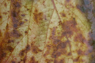
The arranging of these composite images involves a lot of experimentation for each piece before a final outcome is decided on- it can be difficult to know whether two images will blend well colour or detail-wise until they are actually combined. The challenge was to maintain a consistent feel to the images while trying to avoid repetition, which is a precarious balance. I feel each relates well to the discussed keywords, evocative of the subject matter in Baudelaire's writing, yet amorphic in a manner that doesn't impose defined interpretations or ideas on the viewer. The choice to radically change my approach to this project from the paintings to this has been greatly rewarding, with the experimental photography leading me to interesting territory. 


I had looked into potentially using these images as backgrounds for the previously-painted elements, creating the following piece as an experiment. I decided not to pursue it however, preferring the aesthetics and ambience that the photo-compositions by themselves possess. 


Portfolio Review

Four contacted, three responses, one completed.


-To be added to as I hear back-


Physical portfolio review was given by Illustrator Megan Thomas. The following is the general feedback received so far for consideration, though more specific details relating to my work are pending:

1) Be prepared to talk about any piece of work within your portfolio. What was its context? Why is it important to you?

2) Display work in a quality portfolio.

3) Try to fill as much of the page's space with the work as possible.

4) Including a logo is redundant.

5) Listing media used is redundant.

6) Different work such as illustration and photography is best kept in separate portfolios.

7) Consider ordering portfolio selections as strong pieces first, but the strongest last.

8) Always use quality paper and ensure no pixelation is occurring.

9) Quality not quantity, and no more than 30 images.

10) Ensure both colour and black & white works are represented.

11) For experimental / unfinished works, have a separate 'sketchbook' section.


Many thanks to Megan for taking the time to provide this advice.


Parfum Continué / Vin

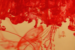
I continued on with the ink-perfume idea, taking further shots of the same technique though this time with improved lighting. The colour red's connotations of blood, love and desire...etc make it perfect for this process.


The unpredictable, organic nature of the ink spreading yields different results every time and means that only a select few may prove to be fitting of the desired purpose, despite taking many. However, the examples that have worked in my opinion have made that worthwhile- the following perfectly resembles the moon shrouded in rolling fog, the moon being another symbol of the mysterious, melancholic and supernatural. The moon is referred to repeatedly within the collection.


Original above, edit below:


The use of drinking glasses for these photos was simply a choice made out of necessity, with something like a fish tank with a flat side and a higher water capacity (unfortunately not available) likely lending itself better for the purpose. However, the idea then came to me of incorporating a glass into the picture, specifically a wine glass this time- Les Fleurs du Mal features a sub-section of five poems about wine. With many of the poems describing decadence and sin, the following image bears the dual interpretations of the sensual visualised fragrance, and also the poisoning of innocence and purity (usually symbolised in white) as the water turns to bloody 'wine'. Note that one of the wine poems is entitled Le Vin de L'assassin (The Murderer's Wine). 


Sunday, 15 December 2013

Ambient imagery

With the success of the ink-drop photos and after feedback from tutors, I decided to continue to take a photographic response to the poems. Although the painted imagery worked, the clean starkness of the negative space doesn't best reflect the very atmospheric feeling of Les Fleurs du Mal- something I could achieve instead with photos. The following is a selection of key words / themes that run through Baudelaire's poems and summarise them well:


 I began taking pictures of different textures and colours predominantly found outside, most selected for pure aesthetics, while some were sought out for their relevant themes- especially those containing or resembling decaying organic matter. The next step was to discerningly select which photos to use, and them layer and combine two or more per image in order to abstract them and create alluring, dream-like colours and textures.


I think that this approach effectively captures the visceral nature of Baudelaire's writing, with the hazy and surreal effects of the combined images capturing mood through the palimpsest-like process of layering. 

The above process was inspired in part by designer Vaughan Oliver, who works with similar ambient textural photo work like the following: 


Oliver is particularly known for his works made for album art, generating images with photos usually inspired by the music it shall come to represent- each example reflects and deepens the sense of the music. My approach for the poetry's themes is the same.

Saturday, 14 December 2013

Website Research


This post is a reflection on some of the different formats of websites utilised by creatives that I have visited, with a list of features I have compiled from them to be considered for my own, which I shall be soon creating. I have secured the domain of MatCoffey.co.uk.

http://mariondeuchars.com/index2.html has two briefly animated introduction pages that present the artist's bio, achievements and specialisms, in addition to the logos of who Marion has worked for. These immediately give a strong first impression and inform the visitor of the context of what they will see on the site in a professional and creative way. Her site also features hand-drawn text for the category names matching the intro animations, which are a nice personal touch. Though not the case here, the downside to the animations is that these can sometimes take some time to load, or just completely fail and even crash the page.

The website http://beljones.com/ is one that I particularly like. It appeals to me due to it's clean, minimal look, simplicity, and ease of navigation. The website is divided into separate categories and sub-categories presented on a bar at the top, allowing for quick and easy selection of the part of the site you wish to view. The lack of complicated animated elements means the site loads immediately. A feature it has which seems to stand out from the rest for me is that the site features as a diary/blog on the homepage in addition to the portfolio sections, allowing for you to present activity, progress and 'behind the scenes' work in addition to finished pieces.

http://jackparra.daportfolio.com/ features thumbnail versions of the images contained on a reel on the top so that you may choose to look at whichever, rather than unnecessarily clicking 'next' on an image slide when you might be seeking a specific image, or don't know how long the reel goes on..

http://www.aaronyeomanphotography.co.uk/ has an interesting format for the homepage where images are shown on a rotation, covering the whole screen except for a navigation bar that fades in and out. The images being large-scale better showcases detail and has a greater visual impact.

http://www.lauradifrancesco.com/#!portfolio/c12wr features clickable photos with the categories, another potentially eye-catching way of presenting navigation.

http://samspratt.com/ uses a variant on the photo reel where each image is displayed next to an enlarged section, allowing for detail to be showcased.

http://www.davehillphoto.com/#/174090/ -This site uses an interesting format of showing the entire portfolio in one page as smaller, clickable images, with a selection of themes listed at the top which take you to the relevant point on the page when selected.

Main desired attributes for consideration:
  • Clear, simple navigation
  • Different pages for different themes, categories...etc
  • Possible blog section
  • Homepage featuring a slideshow, with pause / manual click option

Thursday, 12 December 2013

Parfum


'...in a deserted house, some cabinet
Full of the past's acrid odour, dusty and black,
Sometimes one finds an antique phial which remembers,
Whence gushes forth a living soul returned to life.'

Relating to the idea of depicting perfume, I decided to experiment with photography to capture the idea, after cleaning my paint brushes and noticing the paint clouds flourish in the glass of water. An idea I had in mind is exemplified perfectly in the work of Charles Emerson, the following example being the cover art for The Editors' latest album. I feel the image potently holds a sense of emotion and nostalgia, which are the effects Baudelaire hoped to elicit with his repeated sensory descriptions, and so it definitely serves as inspiration.


I set up a glass of water with a plain white background to take my photos, and dropped ink in while taking repeated shots 


I took this series of photos with the intention of likely using the results as components rather than finished pieces in themselves, but I feel they aesthetically hold their own. One particular shot worked out better than I could hoped for by pure chance, with the ink cloud appearing to resemble a heart. I feel it could be used as a minimalist contemporary book cover for The Flowers of Evil.


Fleurs du Mal

For the next piece, I decided to continue the visualised perfume idea on, this time with a skull as a representative symbol. Death is one of the central themes of Les Fleurs du Mal, often controversially combined in the texts with the other taboo of sex, such as in Une Charogne (A Carcass) and Le Vampire. I took the same approach of a basic pencil drawing as a guide for watercolours.


I was pleased with the outcome with the skull, although the scent detail went darker and muddier than planned, which unfortunately was irreversible. Achieving the subtlety of the first perfume depiction is difficult, one brush-stroke 'too far' and not much can be done. I was trying to achieve a more acrid look with the colours for this version, the darkness of them likely causing the problem. I'm still happy with the result, though it could definitely have gone better. 

For the next piece, I chose to represent Satan, who is mentioned along with other Demons and references to Hell throughout the works. The following line, extracted from one of the introductory poems, reflects Baudelaire's exalting of 'sinful', decadent behaviour and thinking in the rest of the poems; 'The Devil holds the strings which move us!'


I feel this piece was successful, despite the challenge presented by a relatively difficult subject to draw.

Wednesday, 11 December 2013

What does Illustration mean?

"As our visual language evolves, the playing field is levelling. Graphic designers, sculptors, painters, creative developers, and even musicians amorphously meander across different parts of our creative industries. As a consequence, I often wonder what the term 'Illustration' now means. Maybe as a medium it might need to do more than vocationalise aesthetics and cultivate a border palate of profundity for its own survival." -Michael Salu

Traditionally, illustration is thought of as the profession of producing art to accompany text in the context of books, usually drawn or painted. Although this is correct and often the case, it constitutes only a part of what the field entails, the boundaries for which are seemingly constantly changing. Illustration as a word is derived from the term 'enlighten', or to cast light upon, and reflects the role of imagery that comes under the term to compliment and enhance the content of the text it accompanies- the term does not specify or limit the media or format in which this purpose is served, and so I would argue that illustration is really just an umbrella term which encompasses the works of the above mentioned graphic designers, sculptors and painters...etc, despite what is usually assumed. It is the purpose that defines illustration, not the form of aesthetic. Therefore, while the purpose of illustration isn't changing, the number of possibilities for its application IS. This is a result of rapidly advancing technology, opening up possibilities like moving and/or interactive illustrations for apps or digital articles for example. Illustration has often been a platform for the delivery of social and political commentary in addition to more commercial applications, often by the artist themselves- this idea of having a 'voice' is also a key aspect that remains unchanged (if not potentially enhanced) by the recent developments.

In terms of my own work, I have been increasingly interested in working with photography, as I believe that is where my strengths reside. I'm currently looking to incorporate it into my illustration work, while also continuing them both separately in their more conventional forms along side each-other. There's a whole spectrum of ways in which photography can be brought into the field of illustration, meaning lots of room for experimentation. I also believe that works of both conceptual value and pure aesthetics have their place within illustration.

I don't believe that there's any call for replacing the term 'illustration', as it still means the same as it always has- it's the general understanding of its meaning that needs to be changed, or 'enlightened'. I believe the reason for its validity as a term being recently questioned purely stems from the natural and logical adaptation to accommodate for new technology- something that has made obvious the pre-existing span of specialisations that can and have contributed to the discipline. In my opinion, a little less focus on definitions, divisions and genres in general removes a lot of restraints inadvertently placed on creatives by others and themselves. Hybridity, versatility and transcendence of boundaries is surely only a good thing.

Self-Directed Project 2 - Fleurs du Mal

After deciding against my initial project idea, I chose instead to create work based on / inspired by the poetry of the French 19th Century writer, Charles Baudelaire. Specifically, I focused on the collection entitled Les Fleurs du Mal (The Flowers of Evil). The predominant themes of the poems were Sex and Death, which made them highly controversial at the time of release- some were even banned from publication for some time, as a result of 'creating an offence against public morals'. The poems are often complex even in their own language, and it is sometimes necessary to read multiple translations of one text to grasp the meaning behind it, though their emphasis on sense of atmosphere and feeling are interesting and challenging to work with. Wikipedia summarises the works succinctly in describing how 'He also touched upon lesbianism, sacred and profane love, metamorphosis, melancholy, the corruption of the city, lost innocence, the oppressiveness of living, and wine. Notable in some poems is Baudelaire's use of imagery of the sense of smell and of fragrances, which is used to evoke feelings of nostalgia and past intimacy.'

I began by reading through the poems, the themes referred to above becoming apparent from the start. A common visual referred to throughout the works is the heart- the word appears over 50 times in the collection. I decided to use watercolour paints, as colour is integral to the nature of the source material. The following show the first piece in progress:


After completion, I decided to incorporate a visual representation of the perfumes and scents frequently described by Baudelaire. 


The watercolours lent themselves well to the effect, though after some feedback I decided to work over the initial cloudy plumes to look more like the desired result, something that in reality of course cannot be seen, but is often depicted in a recognisable way.


The faded colours of the perfume are intended to evoke the sense of nostalgia conjured in the writing, the colours also inspired by the shades you might see in dying flowers.

Sunday, 8 December 2013

Self-Directed Project 2

For the project that would lead up until Christmas, I chose to do the third option for the second self-directed project, which allowed the freedom of choosing a theme to work with, on the basis that the subject would have depth and the potential to be well-researched. After deliberating on a couple of different ideas, I initially decided to base my work on a collection of old news extracts (spanning over 200 years) that I had come across from where I used to live, given to me by a neighbour. They had been collated from old papers and locally archived documents, type-written up and chronologically ordered in a book. Here are some examples I particularly liked after reading through:


I found the quirky nature of some of the stories interesting and potentially good for illustrating. I began some brief concepts relating to the above supernatural-related extracts while trying to work out how to approach the stories in terms of media, format, development...etc. None of my ideas seemed to have the potential to be substantial with the source material I had to work with, as I decided that I would need a focus, requiring a decent number of similar extracts to illustrate and yield a cohesive collection. After looking, there was unfortunately little else in a similar vein to the snippets I had hoped to draw upon. After some time, I eventually decided to change my project theme for something I found more possibilities in, with room for experimentation. The following are some of my initial results working with the 'Mad dogs' idea, before I switched project themes.


I still feel the idea of illustrating some of these stories has potential, and is something I may revisit in my own time with less factors to restrict it.